
From: gav@jam-factory.com
Subject: Re: Hey
Date: 2 June 2010 08:12:54 BST
To: hello@robcopestudio.com
Hey there Rob,
Sorry about the delay in replying my friend, I've been a bit behind on the ol' emails!
Thank you very very much for the super kind words, that's very nice of you to say :)
I can indeed answer your questions mate, i'd be honoured!
in a few words could you give an outline of who you are and what you do?
My name is Gavin Strange and I'm a 27-year-old man-child originally from Leicester and now living in beautiful Bristol here in the South West. By day i work as Senior Designer for the Digital department of the illustrious Aardman Animations and by night I go under the alias of JamFactory, working on plethora of projects!
How did you start out as a designer / illustrator, what difficulty's did you have starting out and what would you suggest to an developing designer trying to get a foot into the industry?
I studied Graphic Design at a college in Leicester before earning a junior position at a local agency (I didnt fancy going to uni) - I got taught the ways of the web there, becoming a web designer and learning an awful lot! After 4 years I left to persue a career in freelance web / graphic design, moving to Bristol in the process! 3 years of freelance went very quickly until one day a magical email entitled "hello from Aardman" dropped in my inbox, and the rest is history!
Id say the difficulties are getting your work out there, but now with the internet, aslong as you've got a solid & confident grasp over your online representation, everyone has as much muscle as everyone else, which I love. It's much fairer now, so i would really advise making the most of the 'net and getting your work out there! Use things like Flickr, twitter, facebook etc to your advantage!
You've got a sick range of work high profile work, but what advice would you give some one to help them brake into the design market and get there work out there?
I guess using the above advice really, getting stuck into social media and using those tools to get your work seen! I made sure I always had an updated website and flickr, and was always sure to get my web address out there wherever I could, even the simplest things like a nice email signature, it'll get people clicking that link!
Making friends too, thats always a good one - I always make sure to email and compliment people whenever I see great work, that's a great way of complimenting your peers and also making friends, you never know where things may lead!
Basically, don't be shy, show your beautiful work to the world!
Your design and artwork are used across a range of different formats, but which format do you most enjoy working with and why? do you think it is a good idea for up and coming illustrators to widen the range and versatility and work in these different formats?
Oh man yeah totally, diversity within formats and medium, i think, is crucial. Just knowledge of other methods & techniques can only strengthen you and make you a better creative. Even if you stick to just one style or medium, dont be scared to have a play with the unknown!
having a style and producing the quantity of work you have, how do you keep new designs fresh and different to your other projects?
Ermmm, hard work haha! it comes and goes really - like at the moment, I am feeling absolutely burnt out! At work I'm working on a tight-deadline project which required 4 completely different styles of website designing, which has meant I'm burnt out on projects in my own time.
I guess it comes with wanting to change up styles and experiment with things I don't know how to do. With every project I want to try something new and go in a different direction if I can, but sometimes i'm happy with designing in a familiar style, like smooth crisp vectors for example. It really depends on the project!
Is there a specific context you prefer designing within e.g skate products, fashion, homewear etc?
Nah not really, i try to keep it as open as possible really, Being open minded about inspirations and influences can only help to stumble across something new i think! I like to take on each project with fresh eyes, to create something right for the brief!
What percentage of your work is made up of your self directed design work, against the client lead briefs?
Well my Aardman job is 9.30 - 6pm and I come home, eat, do house things then do my own thing from about 8pm - 11pm so just a small percentage really, which is a shame as it's hard to fit everything I want to do in my own personal time but it's a battle I have to face!
is there specific things that clients like about your work and just ask you to do something similar to piece in your portfolio?
There isn't really, well there used to be, but now my 'official' work is at Aardman, which is based on the strength of the studio as a whole, rather than my own personal work, that sort of stuff doesn't come up anymore and the stuff in my own time, is really self-initiated projects as I dont like to do freelance work for other clients in my own time (really can't dedicate enough of myself!)
if you could apply your designs to anything what would it be? and what design would you make for it?
It'd have to be a shoe! A Vans shoe i think, i do like my sneakers and a shoe would be the ultimate! I'd keep it a lowkey affair, black with a little hint of colour with some nice embossed graphic or textured identity somewhere i think! Could go to town on the innersole though!
Fingers crossed one day I could do that!
any final words?
Save often, cry less.
thanks alot for your time.
I hope these answers are all ok dude, sorry they've taken so flippin' long!!
~ Gav
Gavin Strange
JamFactory
Showing posts with label interview. Show all posts
Showing posts with label interview. Show all posts

E-mail interview with tado
hi rob!
hope this email finds you well and calm! hows the build up to the show going? we hope its all running smoothly!
no probs at all about the questions - we'll try and be interesting with our answers :D:D
we're looking forward to seeing all the work in the final show - good luck with everything!!
m and k
in a few words could you give an outline of who you are and what you do?
We are Mike and Katie and we set up our illustration company TADO in 2003. We mostly do illustration work but work across a very wide range of projects with an equally wide range of clients!
How did you start out as a designer / illustrator, what difficulty's did you have starting out and what would you suggest to an developing designer trying to get a foot into the industry?
We decided to set up straight from uni without any experience at all. this was probably very foolish but it meant we had to learn quickly and learn the hard way. we spent a lot of time doing research and promotion work as well as lots of free jobs for friends, magazines and design sites. at this point it was a lot of hard work - both of us were working part time jobs and keeping motivated was quite hard sometimes.
we would say the biggest piece of advice we could give anyone is to research, research and research again about where to target your work and who you should be showing it to.
You've got a sick range of work high profile work, but what advice would you give some one to help them brake into the design market and get there work out there?
as above really - decide where you think you want or can see your work working and target the people who need to see it - whether it be magazine editors, creative directors or directors. make sure you always send a personal email and be prepared for lots of being ignored! however it only takes one of them to see your stuff and like it to get the ball rolling! keep on pushing your stuff and promoting yourself. it'll take a while but hard work always pays off eventually.
Your design and artwork are used across a range of different formats, but which format do you most enjoy working with and why? do you think it is a good idea for up and coming illustrators to widen the range and versatility and work in these different formats?
we dont really have a particular favourite format - we enjoy all of our projects for different reasons! we think its a great thing to do as many things as possible - we'd certainly get bored very quickly if we kept doping the same stuff all the time. these days its an important skill to be able to apply your look over pretty much anything, whether its a tv ad, a product or a website.
having a style and producing the quantity of work you have, how do you keep new designs fresh and different to your other projects?
we have no idea really! we just keep drawing what we want to! its good for us to have each other as we can always compare stuff and get feedback from each other - being able to do that is very important, whether its from a friend or colleague.
Is there a specific context you prefer designing within e.g skate products, fashion, wall murals etc?
nope!
What percentage of your work is made up of your self directed design work, against the client lead briefs?
these days we'd say maybe 15% is self-directed. we always try to do 1 art show per year which is when we get to go mental and do our own thing!
is there specific things that clients like about your work and just ask you to do something similar to piece in your portfolio?
yeah, you always get clients that will want you to do exactly the same thing but slightly different! sometimes its quite hard not to get pigeon-holed into doing the same things.
if you could apply your designs to anything what would it be? and what design would you make for it?
(in words or drawing accepted!)
we'd love to design a huge blimp airship!! in the shape of a panda! :D:D
hope this email finds you well and calm! hows the build up to the show going? we hope its all running smoothly!
no probs at all about the questions - we'll try and be interesting with our answers :D:D
we're looking forward to seeing all the work in the final show - good luck with everything!!
m and k
in a few words could you give an outline of who you are and what you do?
We are Mike and Katie and we set up our illustration company TADO in 2003. We mostly do illustration work but work across a very wide range of projects with an equally wide range of clients!
How did you start out as a designer / illustrator, what difficulty's did you have starting out and what would you suggest to an developing designer trying to get a foot into the industry?
We decided to set up straight from uni without any experience at all. this was probably very foolish but it meant we had to learn quickly and learn the hard way. we spent a lot of time doing research and promotion work as well as lots of free jobs for friends, magazines and design sites. at this point it was a lot of hard work - both of us were working part time jobs and keeping motivated was quite hard sometimes.
we would say the biggest piece of advice we could give anyone is to research, research and research again about where to target your work and who you should be showing it to.
You've got a sick range of work high profile work, but what advice would you give some one to help them brake into the design market and get there work out there?
as above really - decide where you think you want or can see your work working and target the people who need to see it - whether it be magazine editors, creative directors or directors. make sure you always send a personal email and be prepared for lots of being ignored! however it only takes one of them to see your stuff and like it to get the ball rolling! keep on pushing your stuff and promoting yourself. it'll take a while but hard work always pays off eventually.
Your design and artwork are used across a range of different formats, but which format do you most enjoy working with and why? do you think it is a good idea for up and coming illustrators to widen the range and versatility and work in these different formats?
we dont really have a particular favourite format - we enjoy all of our projects for different reasons! we think its a great thing to do as many things as possible - we'd certainly get bored very quickly if we kept doping the same stuff all the time. these days its an important skill to be able to apply your look over pretty much anything, whether its a tv ad, a product or a website.
having a style and producing the quantity of work you have, how do you keep new designs fresh and different to your other projects?
we have no idea really! we just keep drawing what we want to! its good for us to have each other as we can always compare stuff and get feedback from each other - being able to do that is very important, whether its from a friend or colleague.
Is there a specific context you prefer designing within e.g skate products, fashion, wall murals etc?
nope!
What percentage of your work is made up of your self directed design work, against the client lead briefs?
these days we'd say maybe 15% is self-directed. we always try to do 1 art show per year which is when we get to go mental and do our own thing!
is there specific things that clients like about your work and just ask you to do something similar to piece in your portfolio?
yeah, you always get clients that will want you to do exactly the same thing but slightly different! sometimes its quite hard not to get pigeon-holed into doing the same things.
if you could apply your designs to anything what would it be? and what design would you make for it?
(in words or drawing accepted!)
we'd love to design a huge blimp airship!! in the shape of a panda! :D:D
interview with tado
The exhibition was held to support the launch of their Cannibal Funfair figures by Kid Robot, but the pair wanted to do something a bit different. Taking a two- month hiatus from commercial work, Lily saw them collaborate with sculptor Mike Hunter, as well as an old lady called Gran Gran. The former carved Cannibal characters expertly from wooden blocks, while the latter crocheted unique (and slightly wonky) plush versions of them. For TADO, the exhibition was a creative reaction to constantly designing toys on a computer – work that Mike describes as “super, mega accurate” – with all the paintings done by hand too.
“The hand-painted nature suited the project more than anything really,” begins Katie. Mike adds: “The whole thing was a fairly nostalgic look at childhood and the computerised stuff was just too perfect; too clinical. It simply didn’t suit it. When we were kids, children’s books were hand-drawn and hand-painted, and that’s the effect we wanted to replicate, really.”
Right now, the pair are working on a top secret project. A big, American client has hired them to design the characters and backgrounds for an online game, with numerous levels. The project is so big, says Mike, it’s going to take nine months to complete. And when it’s ready, it’s going to land in the educational sector – so don’t expect more sexy pandas.
“It’s nice because it’s a different audience to some of our other stuff,” explains Mike. “It has to be quite PC because of the nature of the client, and being American they view our work slightly differently than perhaps a British audience would. I think some of our work is quite British in its humour, so we possibly have to be a little more literal with them.”
Despite their deeply artistic streak, Mike and Katie are anything but precious when it comes to commercial projects. They had no qualms about working for McDonald’s last summer. In collaboration with their friends at the animation company Red Star, they produced a 30-second ad for Irish TV, promoting the multi-coloured Coke glass giveaway that the fast food chain had running. The colours come together to form a rainbow in front of a TADO landscape.
Another job that has put their work in front of millions of people was their Sainsbury’s cereal packaging. They created six different boxes, each with a print run of five million, for children’s cereal flavours. “Originally they wanted it so that you could stack all six boxes next to each other and it would make a whole landscape picture, but that kind of went out the window towards the middle, didn’t it?” says Katie.
“It was simply because Sainsbury’s boxes have to be displayed next to the competitor’s box really, so they couldn’t be in a line together,” Mike replies. “They had to go next to the Corn Flakes or whatever. We kind of lost that idea halfway through.”
“It’s nice to go to Sainsbury’s and see your cereal boxes on the shelves, or your poster on a billboard or something,” adds Katie. “It’s exciting. It’s something you can tell your mum about, and then your mum will go, ‘Oooo that’s really good’.”
As for the future, neither Mike nor Katie rave about any grand ambitions. TADO are happy just continuing to do their thing. They took a break in Japan last year, which clearly sparked their creativity, and they’d like to make a return visit. Another aim is to do more animation, and to become more independent in terms of how they produce some of their output. This means learning some 3D software, because at the moment they turn to friends when they want to create characters in 3D. “We’ve actually been trying to teach ourselves Cinema 4D, which is like trying to teach yourself Chinese. That’s something we’d really like to do,” says Mike. Katie continues: “We’ve got so many ideas and we’re picky, and we always want to do a little bit more.” Mike finishes the thought: “Yeah, the pair of us are control freaks when it comes to our own work.”
again an interesting insight into the decisions of the designers and the idea of this balance between comercial and non commericial work, again tado are working with massive clients like mcdonals, GOLA - PRODCING BAGS - which are on sale now interviews before they got this stuff out on sale.
“It’s nice because it’s a different audience to some of our other stuff,” explains Mike. “It has to be quite PC because of the nature of the client, and being American they view our work slightly differently than perhaps a British audience would. I think some of our work is quite British in its humour, so we possibly have to be a little more literal with them.”
Despite their deeply artistic streak, Mike and Katie are anything but precious when it comes to commercial projects. They had no qualms about working for McDonald’s last summer. In collaboration with their friends at the animation company Red Star, they produced a 30-second ad for Irish TV, promoting the multi-coloured Coke glass giveaway that the fast food chain had running. The colours come together to form a rainbow in front of a TADO landscape.
Another job that has put their work in front of millions of people was their Sainsbury’s cereal packaging. They created six different boxes, each with a print run of five million, for children’s cereal flavours. “Originally they wanted it so that you could stack all six boxes next to each other and it would make a whole landscape picture, but that kind of went out the window towards the middle, didn’t it?” says Katie.
“It was simply because Sainsbury’s boxes have to be displayed next to the competitor’s box really, so they couldn’t be in a line together,” Mike replies. “They had to go next to the Corn Flakes or whatever. We kind of lost that idea halfway through.”
“It’s nice to go to Sainsbury’s and see your cereal boxes on the shelves, or your poster on a billboard or something,” adds Katie. “It’s exciting. It’s something you can tell your mum about, and then your mum will go, ‘Oooo that’s really good’.”
As for the future, neither Mike nor Katie rave about any grand ambitions. TADO are happy just continuing to do their thing. They took a break in Japan last year, which clearly sparked their creativity, and they’d like to make a return visit. Another aim is to do more animation, and to become more independent in terms of how they produce some of their output. This means learning some 3D software, because at the moment they turn to friends when they want to create characters in 3D. “We’ve actually been trying to teach ourselves Cinema 4D, which is like trying to teach yourself Chinese. That’s something we’d really like to do,” says Mike. Katie continues: “We’ve got so many ideas and we’re picky, and we always want to do a little bit more.” Mike finishes the thought: “Yeah, the pair of us are control freaks when it comes to our own work.”
again an interesting insight into the decisions of the designers and the idea of this balance between comercial and non commericial work, again tado are working with massive clients like mcdonals, GOLA - PRODCING BAGS - which are on sale now interviews before they got this stuff out on sale.
eboy interview
The first time that they ever created a pixel city for a big league client was working for Adidas in 2002. This time the job came through the agency Leagas Delaney. “Adidas is a very popular brand. A lot of designers like it and wear it themselves – it was a very good client,” reveals Smital.
For this image there wasn’t only the self-imposed limitation of working pixel-by-pixel to deal with: the agency wanted a greyscale city that worked alongside the theme of the ad copy. “It’s great that it’s black and white!” says Sauerteig. “But it looks rather empty compared with our latest works.”
The piece brought eBoy to greater prominence in the industry, and while working for big brands isn’t the most important goal for Sauerteig, Vermehr and Smital, it does help on a number of levels. One is artistic freedom. Clients come to eBoy for their style, and tend to trust them to do their thing. Secondly, the money is good. And finally, the big brands spread their work to broader audiences.
“If you do advertising for a bigger company, then a lot of magazines and other people see it and you get commissions based on this. It advertises us, and at the end of the day we get more money working for bigger clients,” explains Smital. “Of course, if you work for clients like this you have to avoid certain elements. You can’t have any violence or naked people in the picture, but you know that and you don’t do it, so it’s OK. We can do it in our own pictures.”
While Adidas introduced eBoy to sports shoe fanatics (and thereby designer studios around the world), it was the clothing designer Paul Smith who took them into the world of fashion. He discovered their posters in Magma Books in London and purchased some, which were used as decorations at one of his shows. Initial contact was made in 2003, and Smith travelled to Berlin to meet them. They began work in 2004, and the clothing came out in spring and summer 2005.
“It was just a very, very nice collaboration to work on,” Smital discloses. “He was very enthusiastic and nice – really interested in all the designs, and yeah, it was great. It was the first project where we did something for fashion, so it was a new experience. It gave us the chance to do something on real, three-dimensional objects, not just in print.”
“It wasn’t much different, really,” adds Sauerteig. “We only made the designs and not the fashion itself. Paul Smith gave us a lot of freedom. We did many different patterns – with flowers, birds, masks – for the designers to choose from, and we did a London cityscape. The small parts of the city like the people, cars and coats of arms were used all over the collection.”
i have highligted key sections, these sections bring to light how they feel about commercially driven design and and insight into how they became so big, and from getting one job they gained more and more.
jon bergerman interview

Jon Burgerman
Leading the way for a decade of British creatives, he has helped fuse commerciality and artistic passion within illustration. Jon Burgerman tells Garrick Webster how he’s shaped his career so far
From Pepsi cans to gallery walls, colouring books to laptop sleeves, clothing to club flyers, iPhone apps and more, Jon Burgerman’s doodled characters pop up just where you’d expect to see them, and very often in places that you wouldn’t. There’s a reason for this: although Burgerman is an easy-going guy with a quirky sense of humour, he’s always busy working on something, collaborating with other artists and spotting new opportunities. Behind it all is a naturally expressive drawing talent that has enabled him to develop a style that is recognised and adored by creatives around the world. So, how does this star of contemporary illustration get so much done?
CA: How easy is it to divide your time between your own projects and shows or client work?
JB: It’s always been a juggling act. You might be involved in a big commercial project that takes up all your time and have to sort of delay working on your own projects. I’ve always got my own projects; sometimes they overlap, like I’m doing an iPhone app with this company in London called ustwo, and it’s called Inkstrumental – that’s one of those hybrid projects.
CA: If you could have your way, would you only work on your own projects?
JB: I probably would. Having said that, it doesn’t mean I wouldn’t produce any commercial stuff. It would just be all mine, completely led by me. That’s why I set up my brand, Burger, so I can still make commercial products and objects. But, you know, it would be me that decides how things are, what things we make and how they look and stuff. Just ‘cause it’s fun, I guess. It’s fun to be in charge, to have that control and be able to do your own thing.
CA: Your style is so well known now. How do you feel about that?
JB: It’s really nice when people say they recognise my work. It’s just the way I draw. It’s weird because now I get students and graduates emailing me saying they also work in the doodle style. I find that really strange. Maybe there is some sort of doodle style but the way that I draw is just the way that I draw. I didn’t realise it’s becoming a category of drawing in its own right. I always assumed that I drew in a very bad way.
CA: What about when your work is copied by other illustrators?
JB: If a big company does it and they’re selling your work, then it’s an easy thing to go after them. But [then there’s] that case of the recent graduate who hadn’t copied the work, but they’d made new work that was very, very similar. They’d taken some of my pieces and used the same colours and the same composition but the lines were all their own. I was more disappointed with the university than the student. I just thought, ‘How could a student graduate with work that was heavily copying any artist, let alone me?’
CA: How do you keep your work evolving between projects?
JB: Just in a natural development; kind of like my work that’s got text in it, where the typography’s integrated into the drawing. That was a little decision I made a year or two ago, to do that and see how it comes out. A lot of people had said to me that they’d read stuff in my work, and I was like, ‘Ahhh, there’s no words in there. There’s no letter shapes.’ I think a few teenagers with homemade cigarettes had been staring at my work for too long.
CA: You recently turned your talents to making music with Jim Avignon. What’s that been like?
JB: I can make my work in different ways, I think. I’ll always be a drawer, I’ll always paint and create images in some respect, but it doesn’t need to be anchored into just working in that way. I can express the way that I work in other ways, so it could be through performances, it could be through clothes, it could be through music, or it could be through a mixture of all these things.
this interview offers some great insight into the work of a professional at the top - well known world wide, producing a wide range of products, coming up with new ones, think the interesting questions being asked are shown like what he thinks of people trying to copy his work, and also the different techniques and ways that he produces his work is really interesting.
http://www.computerarts.co.uk/in_depth/interviews/jon_burgerman


quotes taken from my dissertation
“Materials and tools must be used optimally, never using one material where another can do the same job less expensively, more efficiently, or both.” (Papanek, 1985, p.8).
i think that this is a quites interesting take on design and is relevant today as the profile of designers such as Perry, jeremyville, si scott etc are massive, and there is a huge demand for these designers who produce work that insome way offers a different angle to design, rather than just giving them a good design they give the organisation there name/image and reputation.
i think that this is a quites interesting take on design and is relevant today as the profile of designers such as Perry, jeremyville, si scott etc are massive, and there is a huge demand for these designers who produce work that insome way offers a different angle to design, rather than just giving them a good design they give the organisation there name/image and reputation.
“The economic, psychological, spiritual, social technological, and intellectual needs of a human being are usually more difficult and less profitable to satisfy than the carefully engineered and manipulated “wants” inculcated by fad and fashion” (Papanek, 1985, p. 15).
these just defines the postmodern society that there is a desire for the work of these high profile designers, but a need that is for the sense of it's fashionable to have it rather than do i need it,
these just defines the postmodern society that there is a desire for the work of these high profile designers, but a need that is for the sense of it's fashionable to have it rather than do i need it,
“People seem to prefer the ornate to the plain as they prefer daydreaming to thinking and mysticism to rationalism” (Papanek, 1985, p. 15).
again something that is completly relevent that the illustrative / customised / applied illustrative work gives a whole different angle to design as it forms ever so closely to art.
again something that is completly relevent that the illustrative / customised / applied illustrative work gives a whole different angle to design as it forms ever so closely to art.
“The required object must be shown as clearly, as perfectly, and as truthfully as possible”
(Tschichold, 1928, p. 158)
this is a contrasing opinion which tschichold states during the new typography age, that simplicity is better but is it, i think both can work along side each other and there is a need for each one to exist to sit along side each other and create this contrast.
this is a contrasing opinion which tschichold states during the new typography age, that simplicity is better but is it, i think both can work along side each other and there is a need for each one to exist to sit along side each other and create this contrast.
Regarding Bob Gill’s opinion: “one of the things I do that a computer can’t do is think.”
(Gill quoted in Newark 2002, p. 116)
“What I really want on the Macintosh is a virtual reality interface – armholes in either side of the box so you can reach in and move a logo around; a real paintbrush so you can feel the texture of the surface underneath” (Brody quoted in Newark, 2002, p. 108)
“Because design as a problem solving activity can never by definition, yield the one right answer…it will always produce an infinitive number of answers, some “righter”, some “wronger”” (paponek, pg5 and 6)
“The “rightness” of any design solution will depend on the meaning with witch we invest the arrangement” (paponek, pg6)
which i found interesting - different points of views, i like the different views that come in from these quotes and in some what some sum up the desire of work at the moment - the need for the ornate design much like alot of the designers i have looked at producing very styled graphics, which carry this aesthetic popular stylistic design method that is very much popular at the moment. and can be sold for a very high price.
si scott interview
is Si Scott? Tell us a little about yourself?I am a graphic designer from the Uk who is originally from Leeds but has moved around the country quite a bit (the next plan is to spend some time living abroad hopefully New York or somewhere like that). I left school at 16 and went to Leeds College Of Art & Design (Where I am now a part time lecturer) to study a BTEC in Graphic Design and then a foundation in Visual Communication, before going to Buckinghamshire Chilterns University to study a degree in Graphic Design. Upon completion I stayed in London for another 2 or 3 years and worked for a number of different small designa gencies whilst continuing with my own work and freeelance projetcs on the side.
You’ve been making some really innovative type work. Describes us your process and how you’ve come to make this kind of work.I always start by picking a font I feel fits the brief or works with what I am trying to achieve the piece and then will play around with different page layouts for a while. The next pahse is to just bring the piece to life using fineliners to create the illustration. I always work bigger than the finsihed piece is going to be and scan the illustrations at 1000dpi at 125% so when it is decreased to the actual size it’s very crsip an clean.

You’ve been making some really innovative type work. Describes us your process and how you’ve come to make this kind of work.I always start by picking a font I feel fits the brief or works with what I am trying to achieve the piece and then will play around with different page layouts for a while. The next pahse is to just bring the piece to life using fineliners to create the illustration. I always work bigger than the finsihed piece is going to be and scan the illustrations at 1000dpi at 125% so when it is decreased to the actual size it’s very crsip an clean.
I think I came to make this kind of work just through my love of drawing, type and design and trying to do something that encompasses all them together.


Where do you get your inspiration?
Most of my inspiration comes ffrom music – I am constantly listening to music while I work and the lyrics especially. I’m really into words!
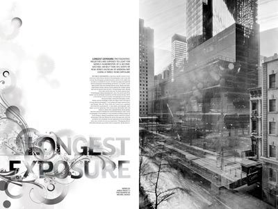
You have just created “We are bitch” with Kerry Roper. How come you got to work with him, and when have you decided to create this already promising studio?
I’ve known Kerry quite a few years now from my days of living in London. We just became mates and always said we’d do something together. So we decided to set up a studio together – we are both really busy with our own stuff at the minute which means unfortunately we haven’t had time to really concentrate on ‘We Are Bitch’ – hopefully we’ll get a chance to work together a bit more in the future.
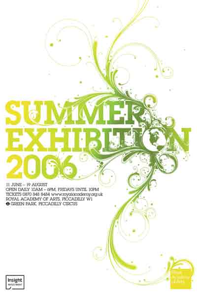
And to conclude, name three of your favorite fonts.
Helvetica (family)
Akzidenze Grotesk (family)
Pagan Poetry
and too many more to mention.
Akzidenze Grotesk (family)
Pagan Poetry
and too many more to mention.

(typeforyou team would like to thanks Si Scott for his time)
this interview gives a great insight into the production techniques that scott uses when making his work it is also interesting to find out about the stuff that influences his work, scott might not do as much applied illustration as designs such as jeremyville but i think scott prodcues more commercially driven design work focusing on print, but also has a small product range such as light shades and that.
http://www.typeforyou.org/2006/08/30/si-scott-interview/
http://www.typeforyou.org/2006/08/30/si-scott-interview/
Another kate moross interview
kate moross interview
i like the idea that kate talks about how if she starts something she'll finish it even tho she might start of hating it you never know it might become something great.
By Heydon Prowse
Artist/designer Kate Moross designed the War-themed poster for Don't Panic. She is only 20 and already her client list includes the Whitechapel Gallery, Young Turks, The Mystery Jets, Merok, Comanechi, Concrete Hermit and Lynx. Her flyer designs have defined the look of a hundred club nights and you might have spotted her Cadbury adverts plastered across billboards all over the place.
Where do you come from, where do you go? Where do you come from Kate Moross?
Come from North London, live in South London. Go to public parks and light fires with friends. Eat sausages and climb trees. Then have a nap.
What does your average day consist of?
Get up - normally I aim for 10, but sleep through my alarm. Get woken by the doorbell by a package arriving, rush down stairs with a blanket around my waist. Then eat some food, have some tea, sit at my desk. Take random breaks to watch some Riki lake, or a lame property program. Work all day, have people over in the evening, eat snacks and watch movies.
You say that you are a workaholic. Do you ever have to stop and find some inspiration with a coffee and a fag?
Stop! No! I just smoke and drink coffee while I'm working.
Is innovation something that has to be worked at, or should it come naturally?
Worked at. I have a rule when I am drawing. If I don't like it at the beginning I never start again, I just make my self stick at it, until I make it into something I like. This applies to everything in my work, I always start somewhere, that might not be a great start or particularly innovative, but eventually you mould it into something that is.
Your style is quite varied. Some of your work is quite geometrical and some is very organic. Does each style demand a different process or state of mind?
Organic work tends to be nearly all by hand. It’s something I can sit at my desk for a good nine hours and come out with a drawing. It is much better to work this way as you see the parts come together. It’s really hypnotic and I don't even notice that I am doing it half the time. The Geometric work demands a little more concentration. The computer acts as a barrier between you and the work and sometimes it is hard to visualise where the work is going, it can be more frustration, but hugely satisfying when you get it right.
On your website you say that you are working on a type face based on the rules of gestalt theory and isometry. Can you explain a little more?
Ok well, I have been studying the perceptual chapter of Gestalt, which basically dictates that the whole is greater than the sum of its parts. This is broken down into sub sections and laws for example, the law of closure – if we see a line that is missing sections but still exists on the same plain our brains will connect the fragments of the line and see it as a whole. I developed some type faces following a handful of Gestalt Laws. This project is something I am going to continue to work with next year. I aim to get a more in-depth understanding of the subject and develop my own book on Visual Grammar.
Who, for you, were the great innovators of art and design?
Hmm, hard one, thank god you didn't ask me who my "inspiration" was. I hate that question, it’s so dry. This demands more thought. I would say Peter Saville, not for his aesthetic, but for his motives, and direction. I have an obsession with the minimalists like Sol Lewitt and the Colour Theorists like Joseph Albers and Johannes Itten. I admire artists who have turned art and design into theories. It his enriched the subject, and certainly makes me stand up and pay attention.
i really like finding out about the concept behind the work of designers and it's really great to see how kate gets her influences from art, science and even sweet wrapers (as stated in the previous interview) also finding out about the rules and guide lines they make for themselves,
interview with kate moross
COMMERCIAL WORK
You seem to have just dived in at the deep end creating flyers and getting your work known in London, but how have you evolved from these commissions to working with the likes of Top Shop, and how different do find working for smaller compared to bigger organisations? (Kirsten Cowie)
Big and small are surprisingly similar, its not really the size of the client that creates differences, its more their attitude that affects the way a project develops.
Big and small are surprisingly similar, its not really the size of the client that creates differences, its more their attitude that affects the way a project develops.
ILLUSTRATION VS GRAPHIC DESIGN VS ART
Is there any reason why you decided to do both Graphic Design and illustration? (Racheal Stayman)
I love both of them, they are in some ways seamless, and in other way completely different. There is certainly more design involved with illustration than there is illustration in design. I enjoy playing the two off each other, and it creates interesting and dynamic projects. It also means there is a range and variation in the type of work I do. One day i could be designing a book, and the next day drawing on the ceiling somewhere.
I love both of them, they are in some ways seamless, and in other way completely different. There is certainly more design involved with illustration than there is illustration in design. I enjoy playing the two off each other, and it creates interesting and dynamic projects. It also means there is a range and variation in the type of work I do. One day i could be designing a book, and the next day drawing on the ceiling somewhere.
The First things First manifesto encouraged Graphic designers to put there skills to uses other than consumer products, do you think it was ever and viable way to live avoiding corporate work? (Jane Cassells)
I read through the manifesto recently, and obviously like most commercially employed designers, one gets rather defensive. Part of me understands the need for such and article, but part of me is also adamant that there is a need for commercial design, even if it is for dog biscuits or hair gel. I mean not that I buy either, but if i did have a puppy or a quaff hair-do (and as a design snob) I like the advertising around me to be smart and good looking.
I think that design should be inclusive not exclusive. But most of all, I am a consumer, and Graphic Designers seem to be some of the biggest gadget freaks, online shoppers and the rest. Like you mentioned, we all have to eat. Commercial work pays my salary, and helps me fund my record label, and the many interns, assistants, and contractors I employ. In my work I always hope to maintain an integrity and sensitivity in the consumer brands that I work with and for. Making sure the projects are progressive, and in keeping with my ethos.
As a practising designer do you feel it is appropriate to impose your own agenda (political/ethical or otherwise) into each project, or purely focus of the needs of the client? (Jane Cassells)
I don't think you should impose your ideas onto a project but instead make sure you chose work that you believe in. For example I have been asked to do numerous campaigns for alcoholic beverage companies, but each one I have turned down. Purely based on the fact that I don't drink, and I don't believe that alcohol should be advertised commercially
I read through the manifesto recently, and obviously like most commercially employed designers, one gets rather defensive. Part of me understands the need for such and article, but part of me is also adamant that there is a need for commercial design, even if it is for dog biscuits or hair gel. I mean not that I buy either, but if i did have a puppy or a quaff hair-do (and as a design snob) I like the advertising around me to be smart and good looking.
I think that design should be inclusive not exclusive. But most of all, I am a consumer, and Graphic Designers seem to be some of the biggest gadget freaks, online shoppers and the rest. Like you mentioned, we all have to eat. Commercial work pays my salary, and helps me fund my record label, and the many interns, assistants, and contractors I employ. In my work I always hope to maintain an integrity and sensitivity in the consumer brands that I work with and for. Making sure the projects are progressive, and in keeping with my ethos.
As a practising designer do you feel it is appropriate to impose your own agenda (political/ethical or otherwise) into each project, or purely focus of the needs of the client? (Jane Cassells)
I don't think you should impose your ideas onto a project but instead make sure you chose work that you believe in. For example I have been asked to do numerous campaigns for alcoholic beverage companies, but each one I have turned down. Purely based on the fact that I don't drink, and I don't believe that alcohol should be advertised commercially
What do you consider to be the professional attributes of a Graphic Designer? (Jane Cassells)
Hard working, curious, and energetic.
Hard working, curious, and energetic.
What's your actual working process? (Rory Mackie)
sit down at my desk - get a bit of paper, sketch out a basic framework, pencil in some type or whatever it is i am drawing, and then go at it straight away with my pens, there is no point of being scared of it. never start again if something goes wrong, i like to work something until it is finished, even if that process i quite pain staking.i think you get a better result than starting afresh. I like to work little areas to perfection, and then spend time joining them together so that the whole thing looks obsessively detailed.
sit down at my desk - get a bit of paper, sketch out a basic framework, pencil in some type or whatever it is i am drawing, and then go at it straight away with my pens, there is no point of being scared of it. never start again if something goes wrong, i like to work something until it is finished, even if that process i quite pain staking.i think you get a better result than starting afresh. I like to work little areas to perfection, and then spend time joining them together so that the whole thing looks obsessively detailed.
Do you go through the same working process with each client or does it differ from job to job? (Hannah Whitmore)
Usually its the same, think, talk, write, draw.
Usually its the same, think, talk, write, draw.
love the simplicity of this answer straight to the point.
i think there are some really good potentiall quotes within these interviews with kate especially the later, i find it interesting finding out the opinions of designers on debates within designing work for commercial clients, but kate rightfully states it helps fund side projects and that kind of thing.


Subscribe to:
Posts (Atom)

